The short version
Casabianca is the clearest proof that I can do more than make isolated screens. I built the brand, product, storefront, creative direction, ecommerce system, merchandising model, customer experience, and day-to-day operating flow.
The work crossed design, engineering, commerce, apparel, photography, copy, fulfillment, and support. That is the part I want this case study to make obvious: I can hold the whole product in my head, not just the interface.
The public version should use real numbers once I pull the final Shopify and social reports. For now, the placeholders keep the layout honest:
Total storefront revenue across campaigns, drops, and always-on sales.
Real checkout, payment, fulfillment, returns, and support volume.
Jerseys, bibs, socks, accessories, gymwear, variants, discounts, and inventory states.
Why this belongs in the Work section
Most portfolio pieces show a narrow slice of judgment: a landing page, feature flow, dashboard, or design system. Casabianca shows the broader range.
I had to make decisions that connected:
- brand taste
- apparel design
- buyer trust
- mobile ecommerce UX
- Shopify implementation
- product photography
- collection architecture
- pricing and discount strategy
- payment expectations in Colombia
- shipping and exchange promises
- fulfillment realities
- customer support
That mix matters for engineering roles because real products are rarely clean UI exercises. They are systems with constraints. Casabianca required me to turn taste into a live business, and then keep the system understandable enough to operate.
My role
I did everything:
- founder and product owner
- brand designer
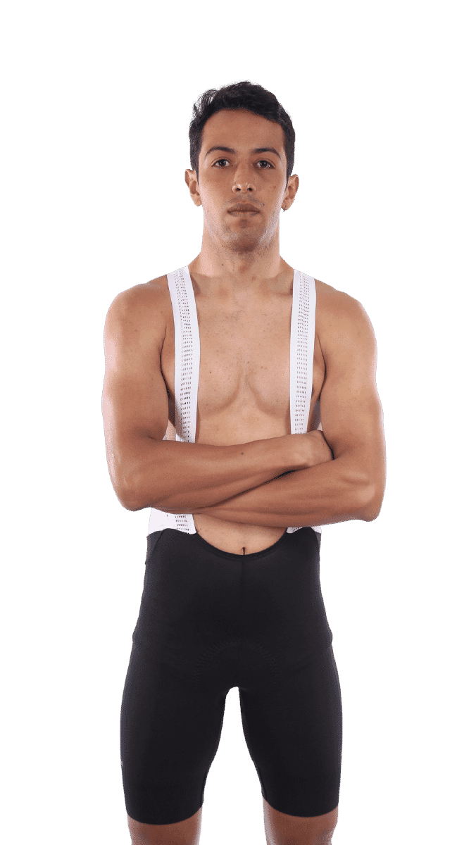
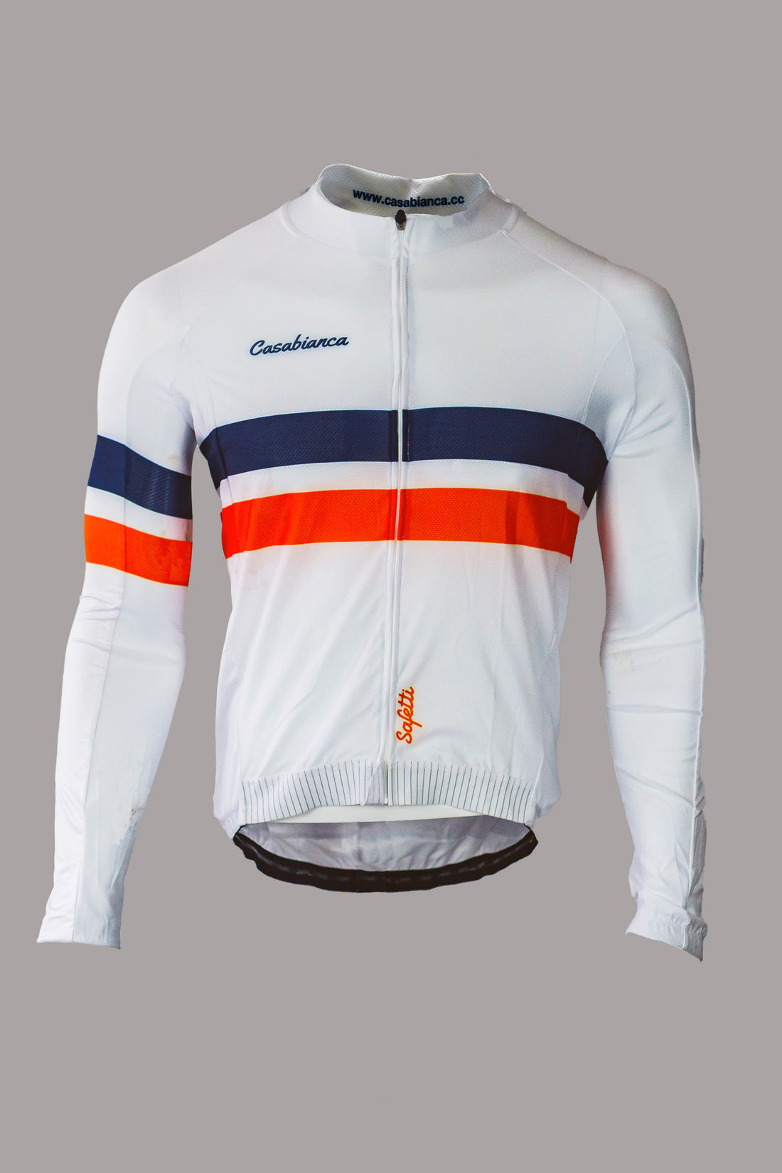
- apparel designer
- ecommerce UX/UI designer
- Shopify storefront builder
- art director and photographer
- merchandising owner
- catalog and inventory operator
- campaign owner
- customer experience owner
- support and fulfillment coordinator
That does not mean every part was equally glamorous. Some of the most valuable work was operational: naming products, structuring variants, checking inventory, writing shipping copy, setting discount rules, making PDPs believable, and keeping the customer journey coherent from Instagram to checkout.
The product problem
Cycling apparel is a trust purchase.
Customers care about fit, fabric, performance, price, delivery, returns, and whether the brand understands the sport. A jersey can look good in a photo and still fail if the size guidance is unclear, the product page feels thin, the shipping promise is vague, or the checkout does not match local payment behavior.
For Casabianca, the product challenge was not only "sell apparel online." It was:
- make a Colombian cycling brand feel credible
- help shoppers understand collections quickly
- make discounts and liquidation feel commercial without cheapening the brand
- reduce anxiety around sizing, delivery, exchanges, and payment
- operate real SKUs and inventory without a large team
- connect brand content and ecommerce intent
That is a product systems problem.
Commerce system map
Storefront strategy
The store had to serve shoppers who arrive with different levels of intent.
Some visitors know they need men's bibs. Some are browsing women's kits. Some come from a discount campaign. Some are comparing the brand against larger international cycling labels. Some are on mobile, mid-ride, or coming from Instagram.
The storefront architecture makes those paths explicit:
- Mujer for women's cycling apparel
- Hombre for men's cycling apparel
- Gymwear for non-ride training products
- Descuentos and liquidation for price-sensitive intent
- product cards that expose sale state, availability, and category quickly
- trust modules for shipping, support, exchange, and MercadoPago
This is the difference between a pretty homepage and a working commerce surface. The structure has to match shopping intent.
Product page anatomy
Size variants, size guide, and product photos reduce the risk of buying technical apparel online.
The PDP needs delivery and exchange promises near the buying decision, not buried in a footer.
Price, discount, availability, quantity, and payment path have to stay obvious on mobile.
The PDP is where brand confidence becomes purchase confidence.
For cycling apparel, the page has to answer:
- What does it look like on body?
- What sizes are available?
- Is the discount real and understandable?
- Can I exchange it if fit is wrong?
- When will it arrive?
- Can I pay with a method I trust?
- Is this brand serious about cycling?
The live PDP handles the basic commerce contract: gallery, price, size variants, add-to-cart, product details, size guide, shipping, returns, and support affordances. The next case-study pass should include annotated desktop and mobile screenshots of this page, because it is the best place to show how ecommerce UX and product operations meet.
Collection and inventory decisions
Collections are operational tools, not only browsing pages.
Casabianca needed collections that could support evergreen shopping and campaign behavior. A liquidation campaign changes how users scan the store. They are looking for discount depth, availability, and a fast path to the right category. Product cards have to carry enough information to let someone decide whether to open a PDP.
Gendered collection paths match common cycling apparel shopping intent and sizing expectations.
Sale traffic needs its own path so liquidation does not make the full catalog feel disorganized.
Sold out, discounted, variant availability, and category placement turn inventory into UX.
The deeper story here is operator judgment. I was making decisions about which products deserved homepage space, how aggressively to frame discounts, when a product needed more photography, and how much trust copy belonged near the purchase path.
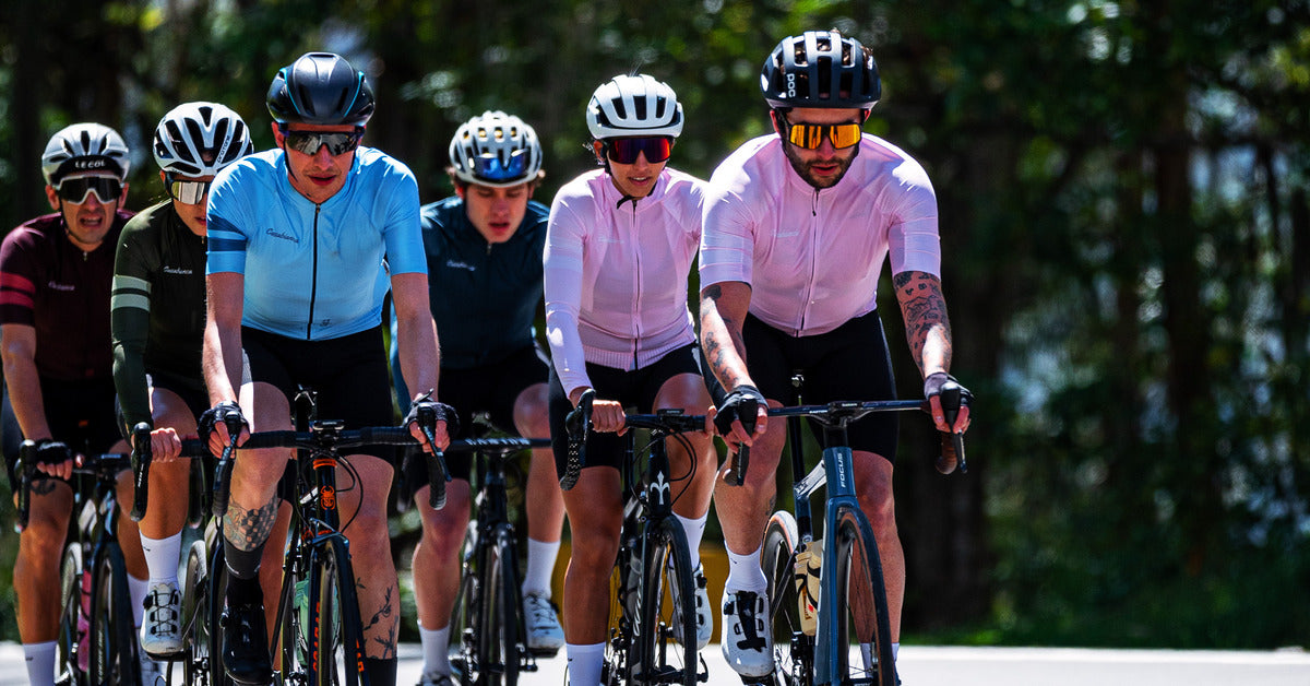
Brand and creative direction
Casabianca is also a brand design case study.
The work included naming, logo direction, apparel graphics, product photography, campaign assets, and the visual tone of the storefront. That matters because a performance apparel brand cannot survive on Shopify defaults alone. It needs a recognizable point of view.
The important hiring signal is that I can move between taste and implementation. I can design the jersey, shoot or direct the product image, decide how it should sit in a collection, and then make the storefront support the purchase decision.
Local market trust
The Colombian ecommerce context matters.
Casabianca had to make local buyers comfortable with:
- pricing in COP
- MercadoPago payment behavior
- national shipping
- free-shipping thresholds
- exchange promises
- Spanish product and support copy
- mobile-first purchase paths
Those details are not decorative. They are conversion infrastructure. A store can have strong visual design and still lose buyers if payment, shipping, or exchange copy feels uncertain.
The live store already surfaces these trust points: free shipping over a threshold, support messaging, 30-day exchange language, and MercadoPago payment flexibility. In the final version, I should annotate those as deliberate trust decisions rather than generic Shopify modules.
Operating the system
The hardest part of Casabianca was not launching the first page. It was operating the system after launch.
Operating meant:
- creating and updating products
- tracking variants and sizes
- managing discounts and campaigns
- responding to customer fit questions
- watching stock pressure
- refining product copy
- planning new creative
- keeping payment and shipping expectations clear
- deciding when to promote, bundle, liquidate, or restock
This is the part I want recruiters and hiring managers to understand. I have lived with the consequences of product decisions after launch. I know what happens when copy is vague, variants are messy, photos are not enough, or checkout trust is weak.
That makes me a better product engineer.
The results to fill in
Before publishing the final public case study, I need to replace these placeholders with real numbers:
Pull from Shopify net sales and reconcile with MercadoPago if needed.
Include total orders, returning customer rate, and best campaign order volume.
Add Instagram reach/follower growth and top campaign traffic source.
The metric list:
- total revenue: $XX,XXX
- total orders: X,XXX
- returning customer rate: XX%
- conversion rate: X.X%
- SKUs managed: XX
- collections launched: X
- best campaign revenue: $XX,XXX
- best campaign conversion rate: X.X%
- Instagram reach or follower growth: XXk
- fulfillment coverage: Colombia-wide shipping
- support volume or exchange rate: XX
If any number is sensitive, I can use ranges. But the page should not hide that this was a real business.
Visual asset backlog
The current page uses live store assets so the case study can ship now. The stronger version should use the hi-fi archive.
Assets to add:
- full-bleed riding image for the hero
- studio product grid with 4-6 best SKUs
- mobile homepage screenshot
- mobile PDP screenshot
- collection grid screenshot with sale states
- Shopify analytics screenshot with sensitive data masked
- Instagram campaign screenshot
- packaging or fulfillment photo if available
- apparel design board showing jersey/bib graphics
- before/after storefront screenshot if any old version exists
The visual standard should be practical, not decorative. Each image should prove a skill: brand taste, product design, commerce UX, technical implementation, or operating discipline.
What I would say in an interview
Casabianca proves I can design and ship under real constraints.
I did not only build a storefront. I created a brand, designed products, shaped the catalog, built the shopping experience, handled trust moments, managed operations, and learned from real customers.
That experience shows up in the way I work now. I think about product surfaces as systems. I care about the boring parts: variant states, loading states, trust copy, metrics, support questions, and what happens after launch. I can design the thing, build the thing, and operate the thing long enough to know whether it worked.
That is the skill level this case study should communicate.